DER PRiNZ Branding 2016
2016 re-branding of my own CI/CD including logo redesign
In 2016 I started to create a new branding for my own webdesign company DER PRiNZ.
Well, actually it´s not a complete new branding but more kind of a refining of what I already had. The logo was renewed and a styleguide was created. No rocket-science though a little bit of bringing things together and giving it all a bit more structure.
No mumbo-jumbo but a lot of fun.
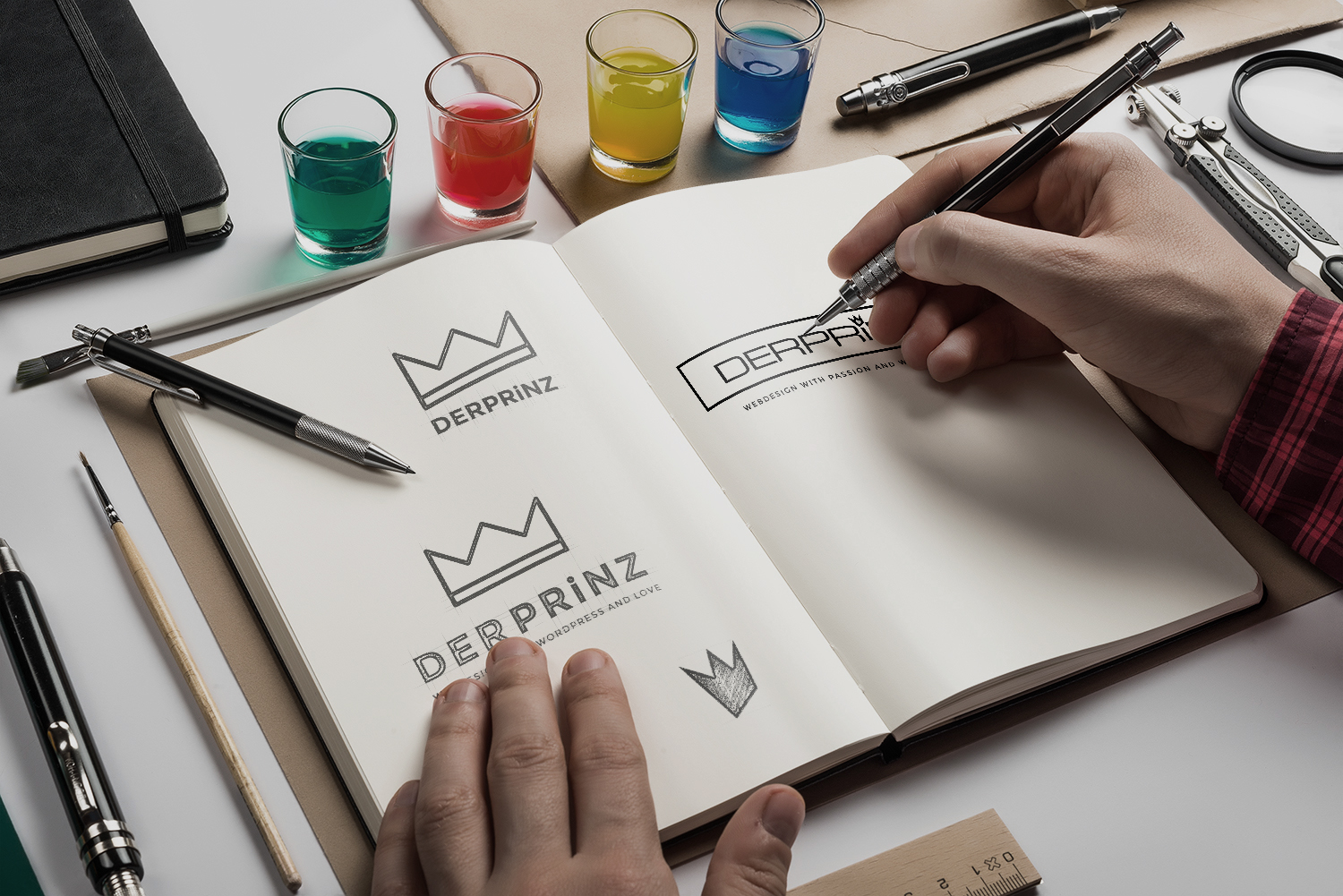
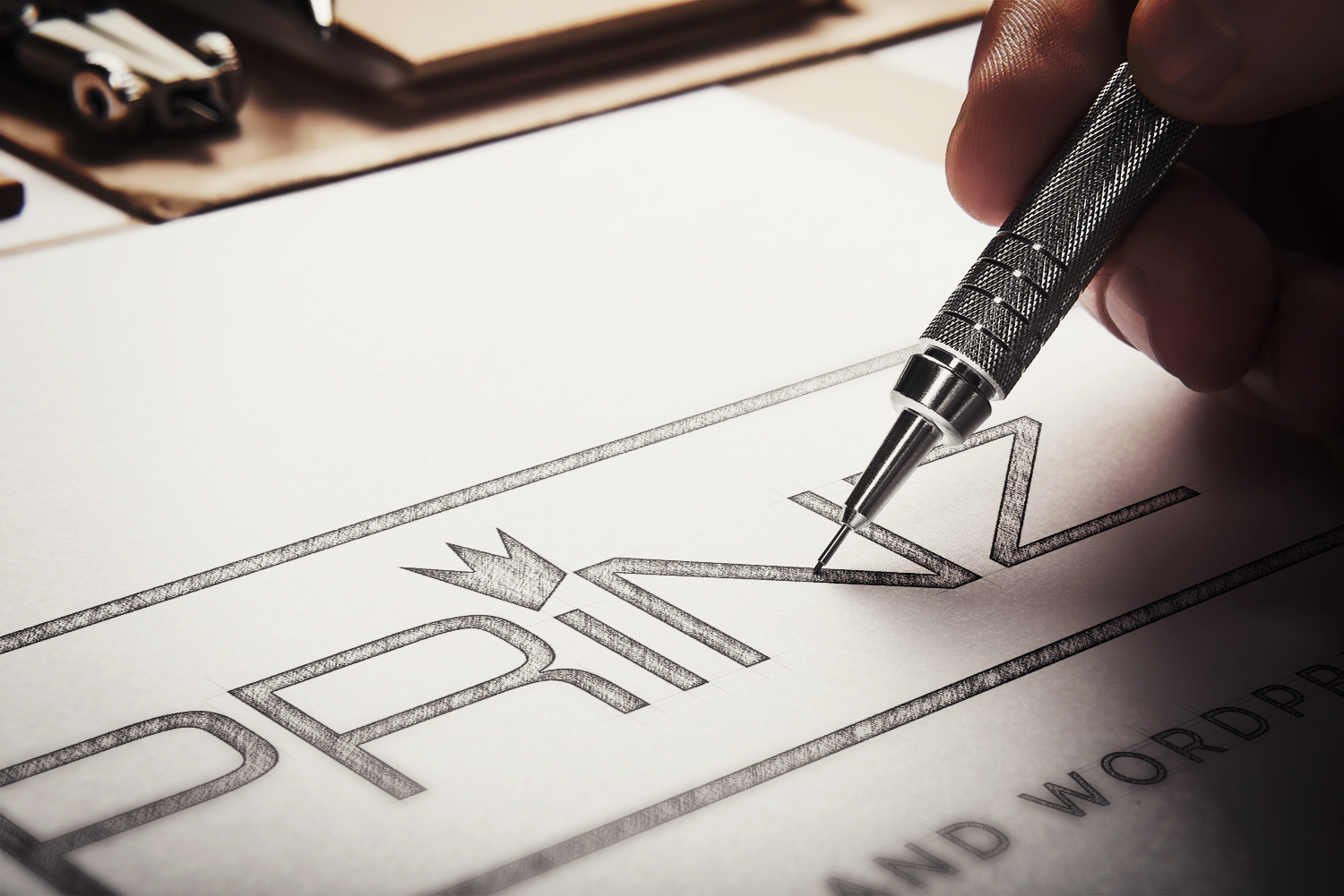
Of course everything started with pen and paper. I played around with some totally other logo variations and styles but at the end I sticked basically with the version/style I already had. I was doing a customer survey and the wast majority of the people I showed the "newer" and the "older" style of the logo prefered the older style.
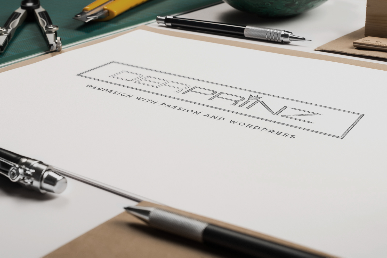
The final drawing of the logo
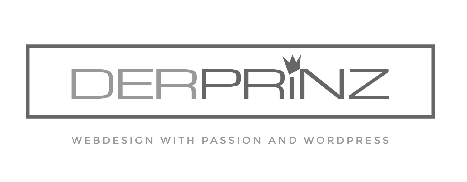
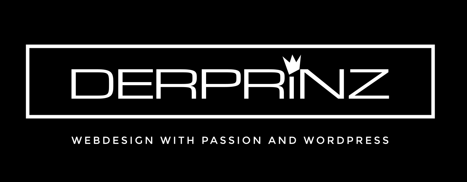
The default logo
Negative logo
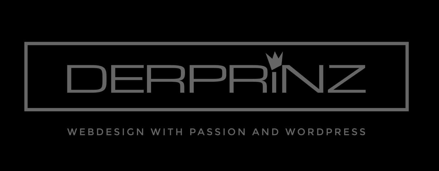
"Silver" logo for special usecases
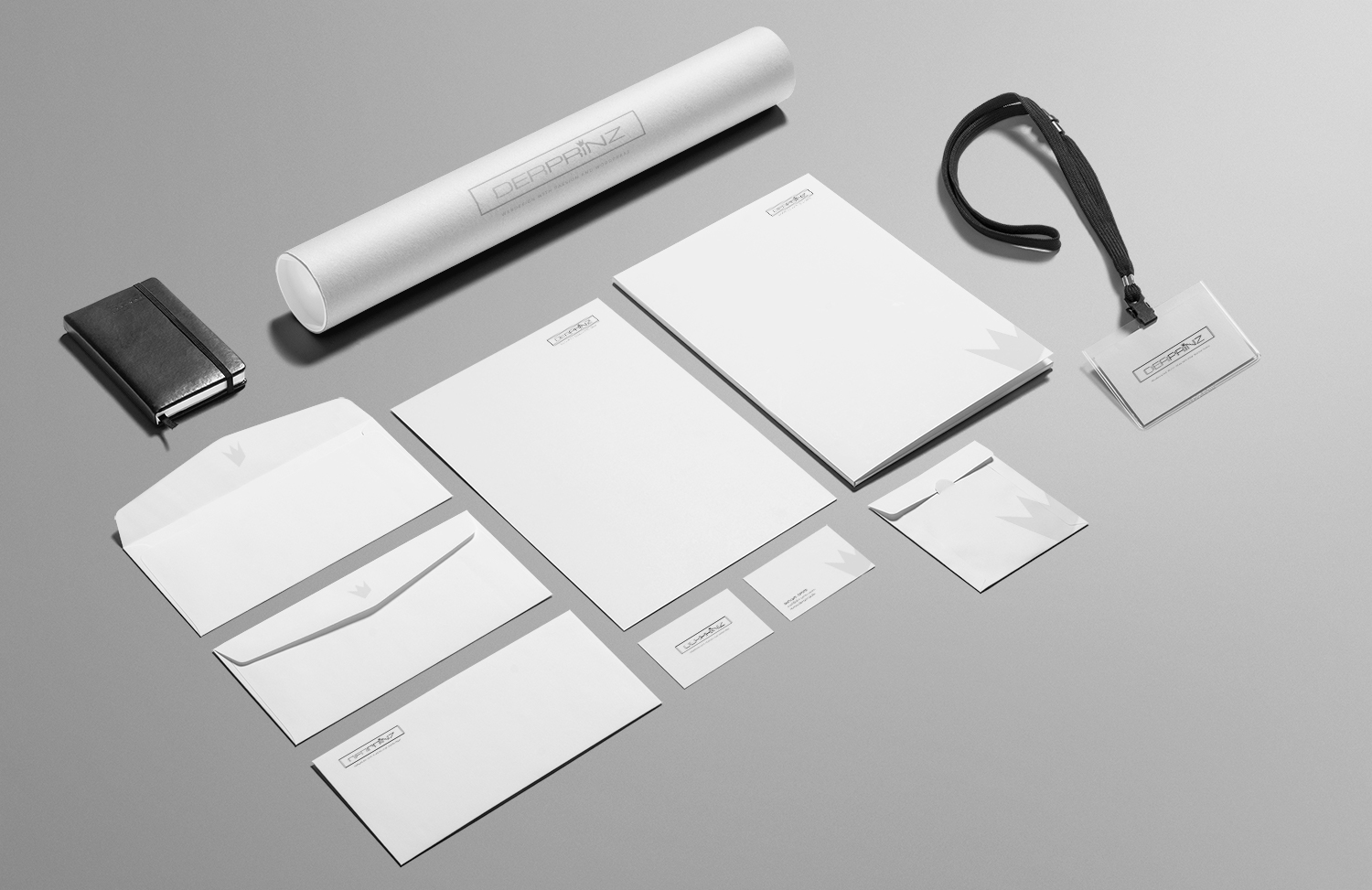
The whole stuff
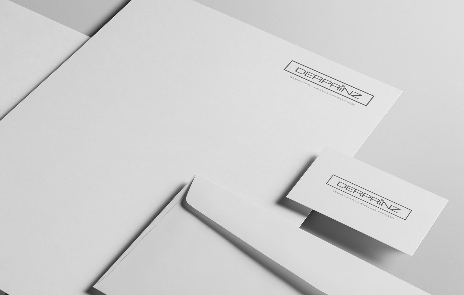
The basics close-up
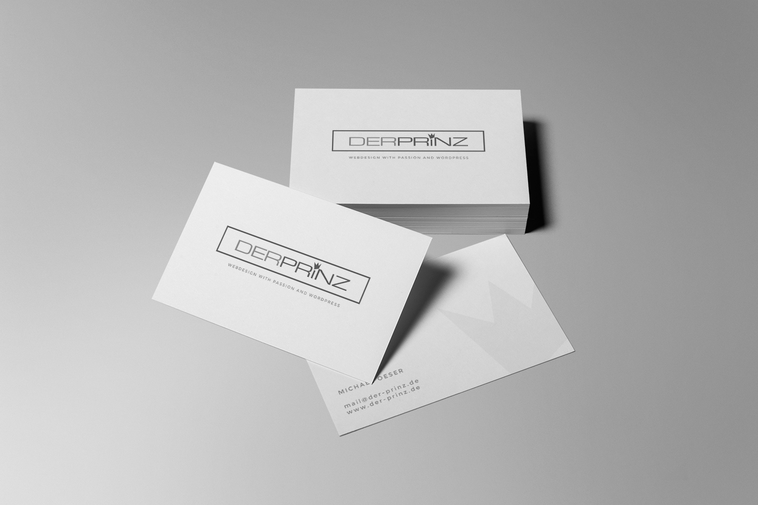
The business cards
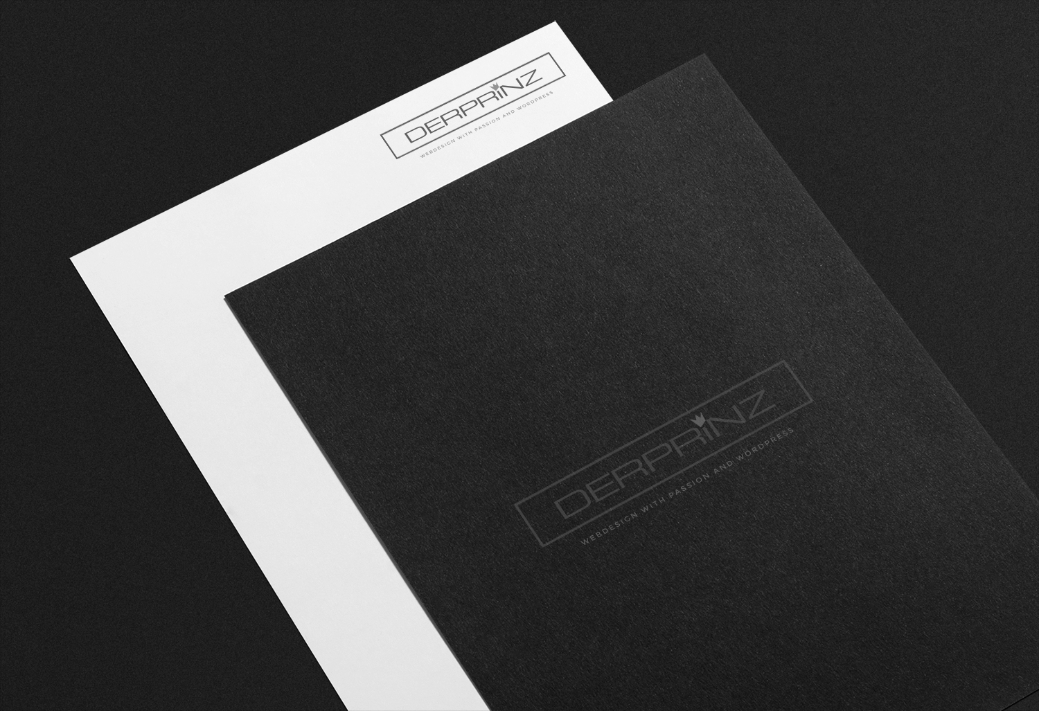
Playing with dark materials
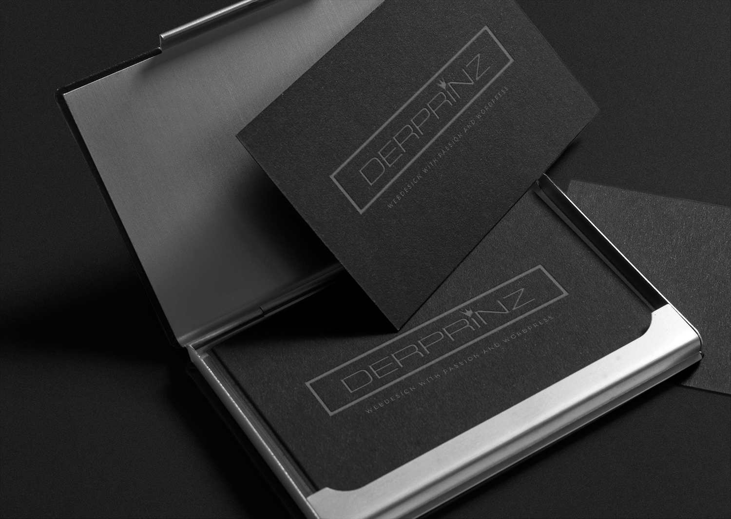
Possible dark "noble" version of the business cards
Interested in how the design was used on my website? Check out this Behance project page or visit www.der-prinz.de directly